Hey guys, So here comes the fourth blog of the Handwritten notes series which we started. We will be talking about Seaborn in this blog. I have uploaded my handwritten notes below and tried to explain them in the shortest and best way possible.
The first blog of this series was NumPy Handwritten Notes and the second was Pandas Handwritten Notes. If you haven’t seen those yet, go check them out.
Let’s go through the Seaborn notes…
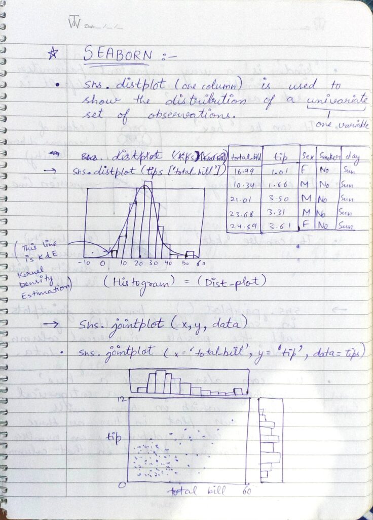
- Distribution Plot is used to show the distribution of a univariate set of observations. This means this plot is used to show the distribution of a column. It can also be thought of as a Histogram.
- Jointplot is simply a plot between two numerical columns.
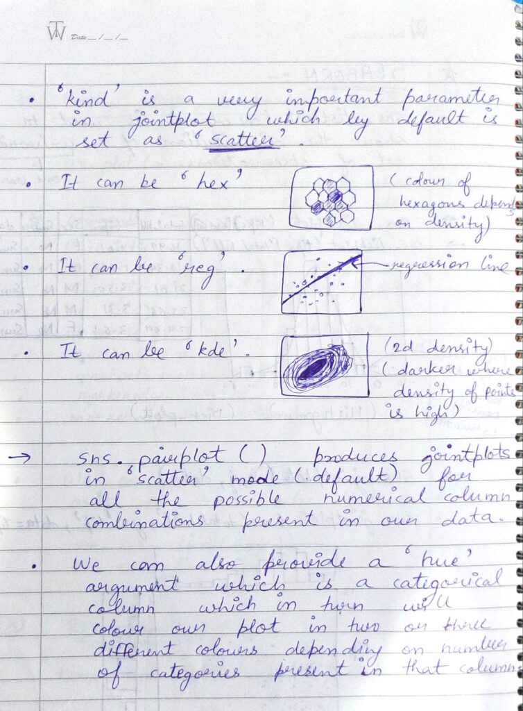
- kind is a very important parameter in jointplot which by default is set as ‘scatter’. We can also set it as ‘hex’, ‘reg’, ‘kde’.
- Pairplot produces jointplots in scatter mode for all the possible numerical column combinations present in our data.
- We can also provide a ‘hue’ argument which is a categorical column that in turn will color our plot in two or three different colors depending on the number of categories present in that column.
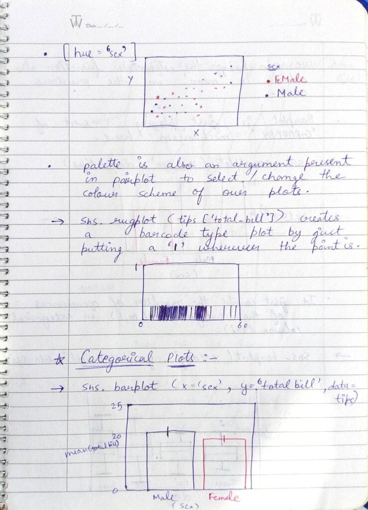
- I have shown the example of usage of hue in the first plot.
- A special argument ‘palette’ can be used to change the color scheme of the plot.
- Rugplot is a type of plot which looks similar to a barcode. It just puts a | where the data point is.
- Now let’s talk about some Categorical Plots.
- First one is obviously the Barplot. We have to provide (x, y, data) as the arguments. Here on y axis we have taken total_bill which is a numerical column. The default estimator for bar plots is mean. We can also change that.
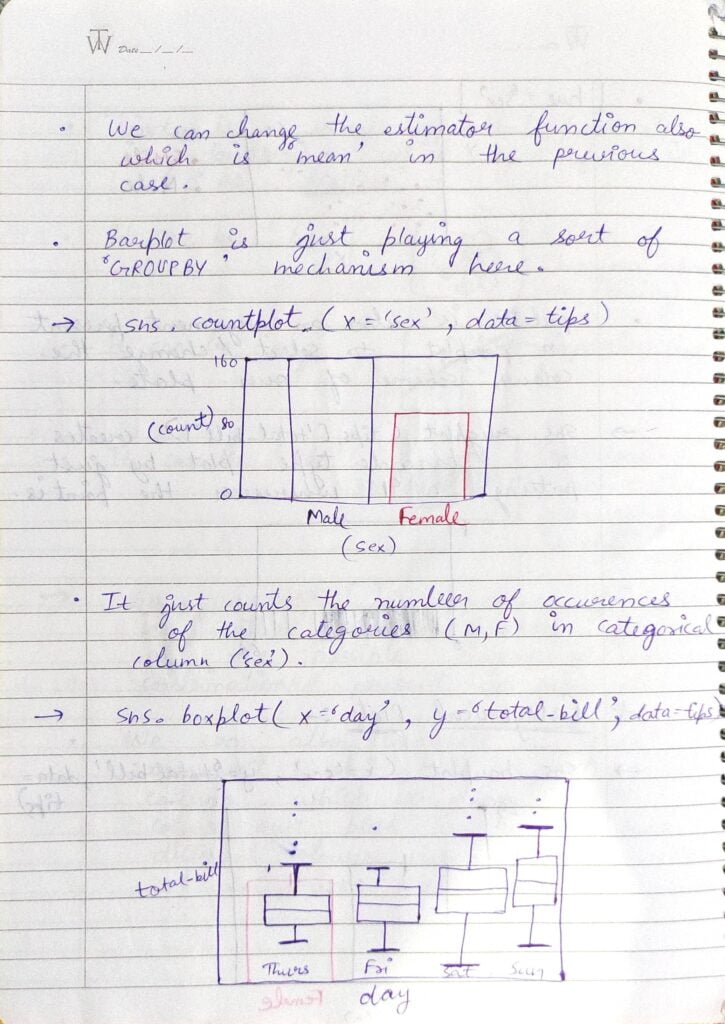
- Barplot is playing a sort of GroupBy mechanism here as it grouped all the columns by ‘sex’ column and then took its mean to show on the y axis.
- Countplot as the name says is just used to depict the counts of certain categories in a column.
- Boxplot is also a very useful plot that seaborn provides. It is basically used to check for outliers and Interquartile ranges.
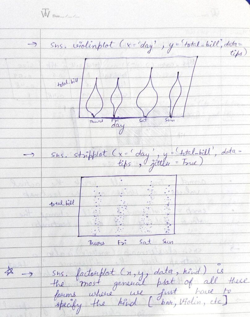
- Violin Plot is a plot that is shaped like a violin as shown above.
- Factor Plot is the most general plot of all these forms where we just have to specify the kind(bar, violin, strip, etc.).
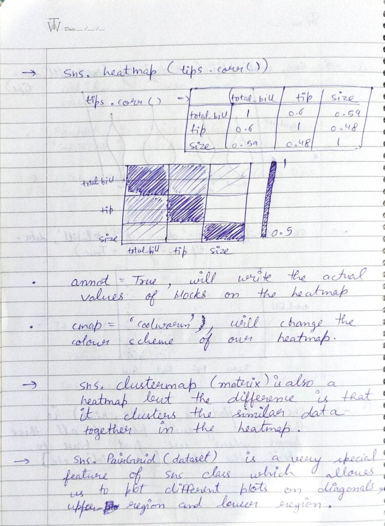
- Heatmap is a very useful plot when dealing with raw data while doing preprocessing. Seaborn provides an easy way to plot Heatmaps using sns.heatmap(). If we want our values written on the plot, we have to pass ‘annot=True‘ as a parameter to the function. We can also change the colormap using cmap parameter.
- Clustermap is also a heatmap but the difference is that it clusters similar data together in the heatmap.
- Pairgrid is a very special feature of seaborn class that allows us to plot different plots on diagonals, upper triangle, and lower triangle.
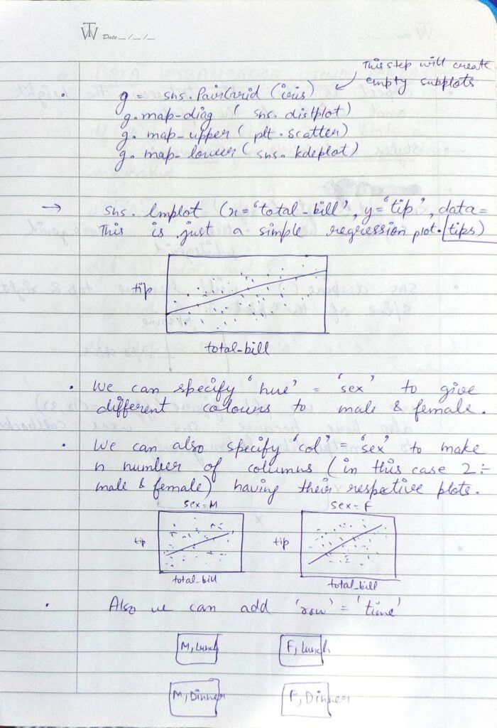
- sns.lmplot() is simply the linear regression plot.
- We can also specify col = ‘sex’ to make n number of columns (male and female) having their respective plots. Similarly, we can do this for the row also.
- In the example above we have split cols on sex and rows on time.
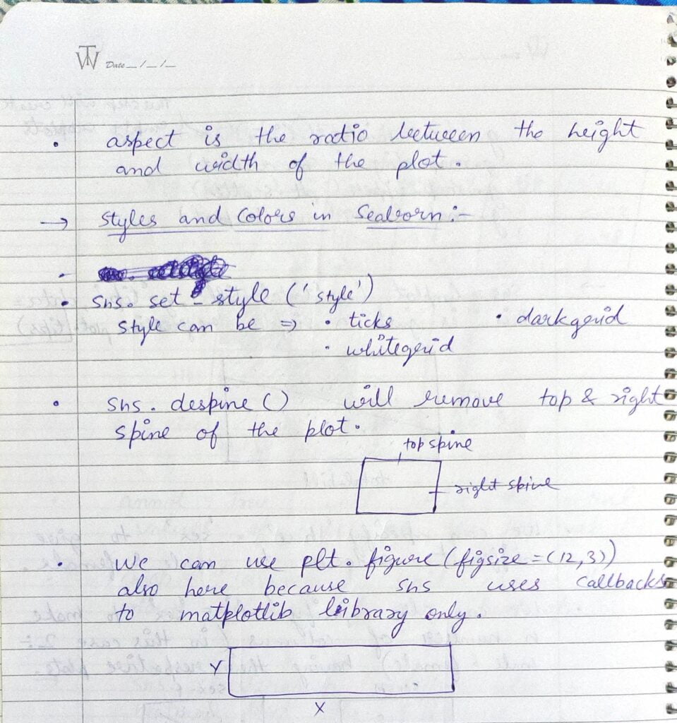
- aspect is the ratio between the height and width of the plot.
Do let me know if there’s any query regarding Seaborn by contacting me on email or LinkedIn.
So this is all for this blog folks, thanks for reading it and I hope you are taking something with you after reading this and till the next time ?…
READ MY PREVIOUS BLOG: MATPLOTLIB – LAST-MINUTE NOTES – HANDWRITTEN NOTES
Check out my other machine learning projects, deep learning projects, computer vision projects, NLP projects, Flask projects at machinelearningprojects.net.


